Evaluation
Evaluation
After a lot of experimentation, I had realised that the delicate sheer fabric is something I could not develop if I wanted a merge of both my first part of the project and the royal armouries. I had started laser cutting and engraving on wood, which was very interesting, but I was more interested in what I had discovered myself. I found some very interesting ways to manipulate those sheer fabrics to be able to work with them and get stiffer sections through mixed media. Such as, liquitex matte gel, impasto transfer gel and the metallic powder paint. All of these materials allowed me to work creatively in a very new way from what I have been doing previously in my practice.
 |
| fig 1 |
 |
| fig 2 |
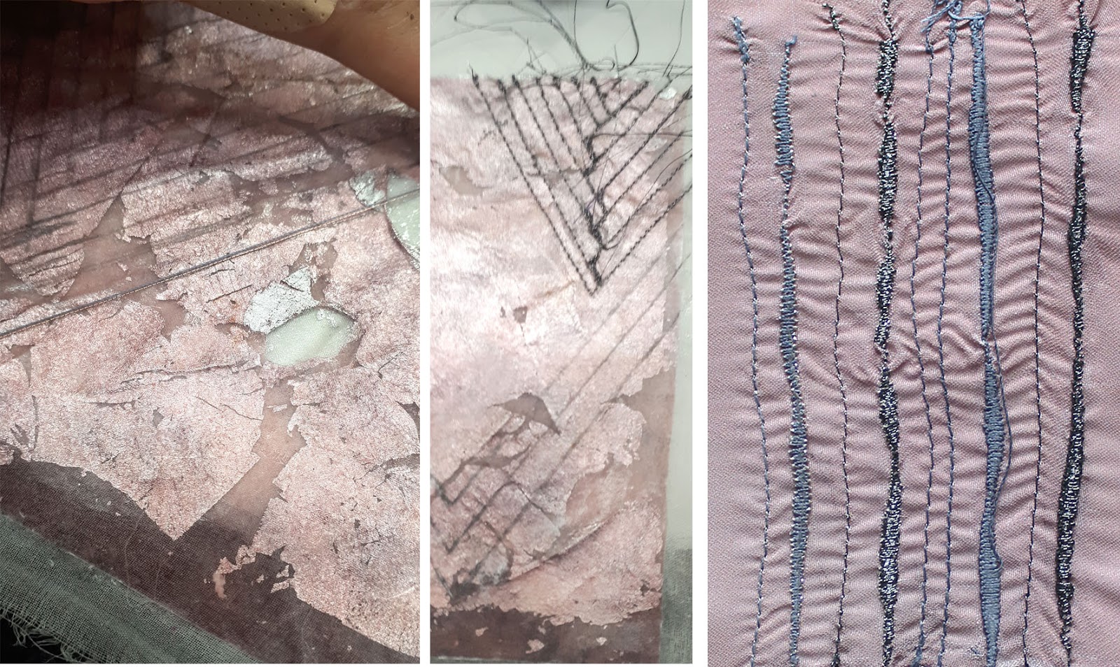
I had started struggling figuring out the colours. The impasto transfer prints have a stiffer handle and so they leave permanent holes of the needle. I wanted to emphasise on the pattern so I went for darker colours but they looked too strong on this delicate colour. fig 1 shows using the black pearl metallic thread alone and with silver underneath, the surface started tearing apart from unpicking twice, so I had to coat the area twice with PVA to work on it again. This time I experimented on a separate sublimation print to see which colour alone or a mix, works better.
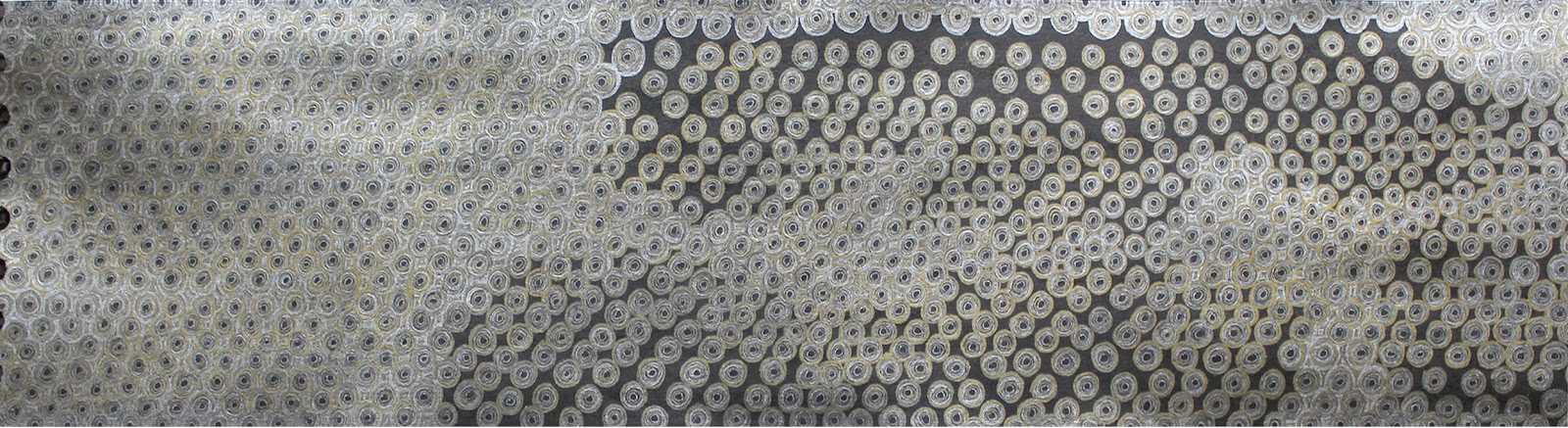
My project is mainly based on to animal's outline or the structure; in my previous blogs, I have mentioned how I decided upon minimal designs and structures for more time consuming techniques. Therefore, in fig 2, the second design is a respond to my first part of the project's drawing and has a cooler tone to it. The V-shape stitches are also a way I have minimalised the bird shape. This shape, when stitched, looks like a bird in flight.
Third design, in fig 2, has a herringbone stitch. This was much unplanned. I just heat pressed the plain surface to flatten it out and it turned into this warmer tone in a few places. The warm colour with the silver background reminded me of the Royal armouries; therefore, I decided to stitch this pattern.
 |
| fig 3 |
The same principal has been used in this pattern-darning sample, too, as shown in fig3. It was very hard to decide on which colour to use for the diagonal line. Even though silver has been working much delicately, I decided to take risk and used gold. This technique, being extremely time consuming, I think the risk was worth taking, as I used advice from my first feedback when there was no development at all. The reason why I was so intrigued to use this technique in this project was that I have been a weave student, previously. In addition, not only did it help me step in the embroidery area, but also it is an effective way to change the drape or the feel of the fabric. Such as, how working with wire could change the handle completely where I just used a cotton thread.
 |
| fig 4 |
This piece was just an
experimental piece at first, but the more I saw it, the more I would feel that
I could do something more to it. To bring some colour; it looked very dull yet
interesting to work with. I decided to just keep it with my work at all times
so I could just see if it works with any other piece of mine or some other
colour. In fig 4, it can be seen that I just spilled some black ink on the
piece by mistake. I thought I had ruined the piece. However, I decided to learn
and find something from my mistake and use this scenario to develop this
piece.
 |
| fig 5 |
Just a single line of silver pen, in
between the strips gives a softer look whereas just the black lines
look very strong to look at.
 |
| fig 6 |
 |
| fig 7 |
Due to lack of time for the royal armouries project, I had decided
to keep one design constant, throughout to make it less complicated. It is
the design shown in fig 6.
I was very interested to use the multi-headers for this design as I
thought it could be very interesting to have this design from my
drawing and embroidered as illustratively on to fabric.
Unfortunately, I was scheduled to be inducted just a few days before the
deadline. Therefore, I decided to experiment with other techniques and get the
design in more of a textured form. Such as the metallic powder paint, as seen
in fig6, and using free hand embroidery.
Fig 8 shows my small
multi-headers sample. After trimming, I found the stitch pattern very interesting and
thought I should use it for
my final presentation. However, I needed a black background, so I tried dying it. It dyed the yellow fibre in the
gold thread and the white fibre in the silver thread, leaving me with just a
thin silver filament, which looked, very sparkly and not very sophisticated. I
tried washing it off right after but it left a blue pigment behind
 |
| fig 8 |
.
Comments
Post a Comment