Visual Research
Visual research
At this stage, I have an idea as to what direction my work
might go towards: which is the silhouette or the outline of the animals,
patterns and two contrasting colour palettes. I, now, had to start thinking
more in to depth in terms of the texture, finishes, dimensions and the
composition in work that I might develop from my drawings into a more of a
textiles piece.
Why I decided to choose these Artist’s plates to base my research on, and
influence my work?
Colour
As I had mentioned in my first blog, I had decided to come up with a warm and cold colour palettes. Due to their colour and animal designs, despite of the type of art i.e. pottery, when I’m mostly attracted towards pattern, these two plates caught my attention out of all the other collections that where in the gallery.
As I had mentioned in my first blog, I had decided to come up with a warm and cold colour palettes. Due to their colour and animal designs, despite of the type of art i.e. pottery, when I’m mostly attracted towards pattern, these two plates caught my attention out of all the other collections that where in the gallery.
Pattern
On my way to the gallery and during my time inside the gallery, I found some
inspiration for my pattern: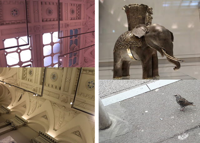

·
The interior of the building
·
A sparrow on my way
· An Elephant's sculpture inside the gallery
Texture
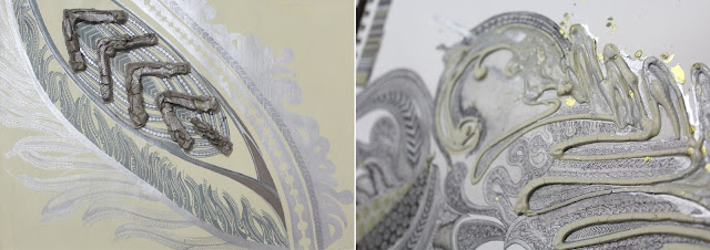
I have looked at William De Morgan and Halsey Ricardo’s collection in the Manchester Art gallery for my archive research. In my work, I have took certain elements from Morgan and Ricardo’s collection, and tried to in cooperate with my style of working: which is fine line drawing, pattern and embellishment, like foiling the backgrounds etc.

The Artists’ pieces has very subtly glossy finish to them as seen in the image, which is something I
have experimented in my colour swatches by coating a thin layer of PVA glue,
initially. As I had used gouache paints. I noticed that the glue makes it very
clumsy in texture. Therefore, I tried it again by speeding up the motion of
applying the glue on top of gouache paints; it worked, but I had concerns for
it.
·
Firstly, it was a little too shiny.
·
Secondly, if it touches another plastic surface
it sticks to it and the layer of glue tears apart.
·
Thirdly, apart from a metallic pen, I could not
draw on it.
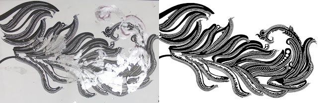
Now I have decided to mix some silver ink in to the paint, in very small amount. As a result, they dried up to be looking more metallic then they looked when wet.
After a lot of experimentation
with different materials, I tried mixing some metallic powder paint in to acrylic and it gave me a
very beautiful result. Acrylic is a little shiny in its nature, mixed with the
metallic powder which dries matte, when mixed together, gave each other their
qualities. The result was a very subtle lustrous look and texture with a
surface where I could draw on.
Comments
Post a Comment